10 Most Popular Neutral Paint Colors & How They can Work in Your Home
Fresh paint can brighten up a room and completely transform the mood and paint is a great cost-effective way to freshen up your home! You don’t have to paint with bold or bright colors to see amazing effects that paint can have in your home. In fact, neutral colors can greatly enhance the appearance of any room by adding warmth. Neutral Colors are also extremely versatile and can complement any furniture style, decor, fabrics and other amenities in a room. Here are some of the top 10 neutral paint colors and how they can work in your home!
1. KILIM BEIGE (SW 6106)
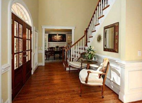
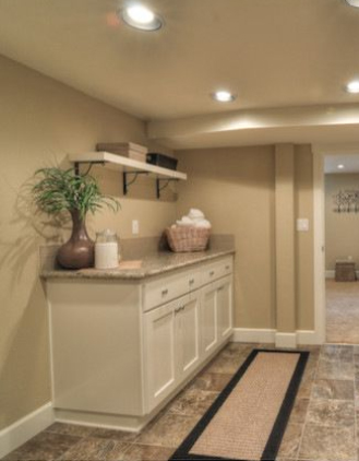
Kilim Beige is at the top of the list because it has a warm, comfortable look. It complements dark hardwood furniture and natural stone flawlessly. If you prefer the natural look, then this neutral is the top choice for you.
2. ACCESSIBLE BEIGE (SW 7036)
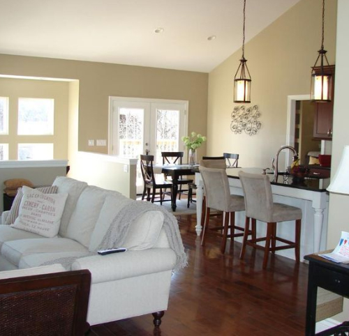
Accessible Beige is one of the most versatile and flexible shades in the Sherwin-Williams neutrals lineup, which is why it is toward the top of the list. Whether you have a modern or traditional style, Accessible Beige provides a smart backdrop for other decor elements.
3. IVOIRE (SW 6127)
Ivoire has golden undertones, which makes it one of the warmer neutral shades in the collection. If you are going for a traditional look, then pair Ivoire with brown and rust colors. Pair it with gray and white decor and accessories for a more contemporary style.
4. URBAN PUTTY (SW 7532)
As its name suggests, Urban Putty has cosmopolitan feel. It’s a popular choice for modern decor and complements industrial accents, such as slate tile and steel. Whether it’s for the kitchen or the bedroom, Urban Putty works in any room of the house.
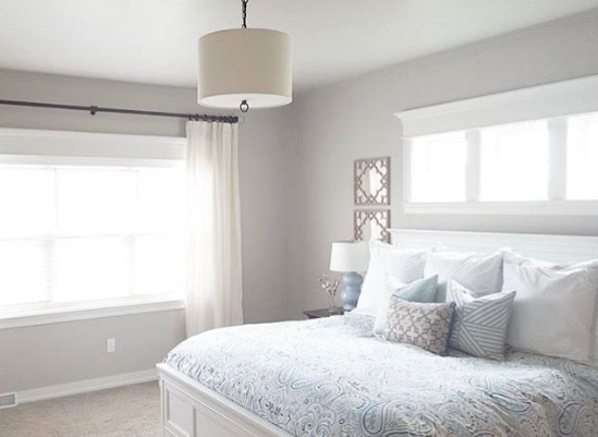
5. LIGHT FRENCH GRAY (SW 0055)
Light French Gray is another versatile color that can help you transform the mood of a room. By pairing it with any number of different colors, it can take on a totally distinct personality. Paired with aqua and blue colors, it creates an ocean vibe. The color looks elegant and sophisticated when layered with black accessories and furniture.
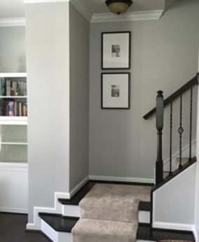
6. AGREEABLE GRAY (SW 7029)
Agreeable Gray goes along with any decorating style or theme. You can cool the color down by pairing it with dusty blue colors or warm it up by adding terra cotta accents. Pair it with creamy whites for a clean, crisp appearance.
7. WHOLE WHEAT (SW 6121)
With its warm and relaxing feel, Whole Wheat is the perfect color for a laid-back family room. It also pairs well with natural elements to create the perfect backdrop for a rustic kitchen.

8. MACADAMIA (SW 6142)
If you are into a down-home feel with worn leather, pottery and hand-woven throws, then Macadamia is the color for you. It is warm and inviting, so it goes well in living rooms and dens where guests are always welcome.
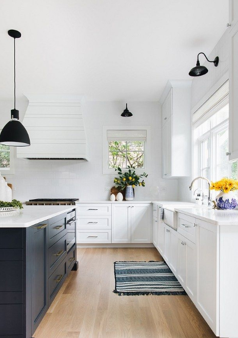
9. EXTRA WHITE (SW 7006)
Extra White is one of the crispest and brightest whites available. It reflects natural light to create the feeling of spaciousness in small rooms. It’s also a great choice if you decorate your room with black and white photographs and prints.
10. SUMMER WHITE (SW 7557)
Summer White is a bit warmer than other shades of white. It pairs well with pastels in rooms that receive a lot of natural light to give the room a summery feel.
No matter what your decorating style you prefer, you’ll be able to find a neutral shade that perfectly complements your home. For feelings of tranquility and calm, opt for cool neutrals. For a timeless and traditional feel, opt for warm neutral colors. Happy Painting!